Why are Weather Watcher system tray icons so small and ugly?

Why are Weather Watcher system tray icons so small and ugly?

I really like Weather Watcher but have always hated the system tray icons

If you could use icons like what Weather Alarm clock uses that would be sooo great!
http://www.postimage.org/aV29_02i.jpg

http://www.postimage.org/aV2mHatr.jpg

superman75, I wouldn’t call them small and ugly – but, rather “normal” :icon_smile: Most Windows system tray icons do not look like the icons that Weather Alarm Clock uses. In fact, Weather Alarm Clock is not using actual system tray icons.

To answer your question, I will be looking into something like this for Weather Watcher.

Sweet! Animated / non-animated .PNGs that really look sharp! (heh, I know, jumping the gun - but still - when you added additional skins options and I started using the BayArea icons for the System tray I was all set…so, naturally, an improvement in functionality here would be a great bonus to both WW and WWL users…

That would be so great! :slight_smile:

The 2 most wanted things I have wanted for Weather Watcher are bigger and nicer looking system tray icons and Realtime weather updating!

It would be great to have something similar to Weather Clock’s tray icon for WW, I think current icon is unattractive and it definitely lacks a weather condition picture…
Unfortunately Weather Clock isn’t compatible with Vista so I wasn’t able to watch it in action but I really like the screenshots.

Weather Alarm clock icons for temp and conditions are very nice looking and easy to see. You do not have to put your face almost right up to the screen to make out what the temp and conditions are.

I am very glad to hear that Mike Singer is looking into making the icons more like weather alarm clock :slight_smile:
http://www.postimage.org/aV2mHatr.jpg
http://www.postimage.org/aV2mIIL0.jpg
http://www.postimage.org/aV2mJlFi.jpg
http://www.postimage.org/aV2mLknr.jpg

Now compare Weather Alarm Clocks weather icons to Weather Watcher

http://www.postimage.org/aV29_02i.jpg

If weather watcher get icons just like Weather alarm clock I will be one happy weather nerd!!

There are different icons other than Classic available. Have you tried them?

Yes I have and they are all too small and ugly.

I guess everything else is small and ugly after seeing the Weather Alarm Clock icons :cool:

I hope you don’t think I am making fun of weather watcher because thats not what I am trying to do.

I think Weather Watcher kicks butt! I just wish the icons looked a lot better in the system tray :slight_smile:

superman75, nope, I really don’t mind. I am agreeing that those icons looks better.

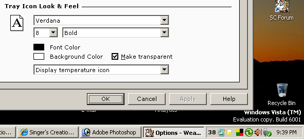
I think your temperature icon looks pretty good. I’ve spent a lot of time (embarrassed to say how much :slight_smile: stepping through all the fonts on my system, trying to find one that would result in a readable temperature display. WW doesn’t seem to render fonts the same way as other apps.

MKairys this thread may interest you:

http://www.singerscreations.com/Forum/v … php?t=1465

Interesting, but no action items I can discern :slight_smile: Here, I’ve assembled a few of my experiments: http://img518.imageshack.us/img518/2665/fontsui4.jpg

First, some likely non-TT fonts, all at 9 (or 10) bold: Terminal (1), MS Sans Serif (2), and Courier (3)

Next Verdana, at 9 normal (4). Not too bad, but other digits like “4” are worse (5).

At the moment I’m using MS Reference Sans Serif 9 normal (6), (7). Readable, but not what I’d call lovely.

Wow!! I agree they are not pretty MKairys. Another reason not to upgrade to Vista. :lol:

What do they look like on your system Mike? What font and attributes do you use?

Don’t get me started :wink:

This is from my taskbar today. Look how clear and big the Temp and weather icon is :icon_smile:

http://www.postimage.org/aVkeYES.jpg

Maybe Weather Watcher could take over the clock that way it could use these great looking Weather icons from “Weather Alarm Clock”
http://www.postimage.org/aVkq33S.jpg

MKairys, your fonts look ugly…
I use Vista too and mine font is OK, not pretty of course but just fine and easily readable.
I wanted to find out which font I use and it looks like there is something wrong with my WW since it doesn’t show any font in options whatsoever :???:

http://www.postimage.org/aVno0ir.jpg

Does anyone know how to fix this?

I heard the same thing regarding Windows XP not so long time ago :wink:

Here’s a screenshot of my tray in Windows Vista:

I’ll include a fix for that issue in the next unreleased Weather Watcher build.